The 2027 Color of the Year Is Celery. Here Is Why I Am Passing.
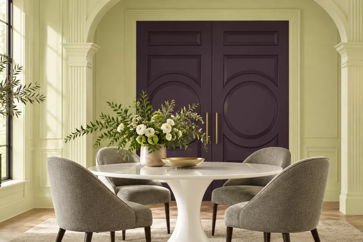
Sherwin-Williams has named Celery, SW 6421, its 2027 Color of the Year. It is a pale, herbal green with a yellow undertone, presented as a calm and restorative reset for the home.
I love that Sherwin-Williams starts a conversation about color every fall. I read the announcement with real interest, as I do every year. But after more than two decades of designing, remodeling, staging and selling fine homes on Milwaukee's North Shore, my advice is clear: Celery does not belong in your home
The undertone tells the story
Every paint color has an undertone, and it shows up the moment the color meets real light. Celery carries yellow, and yellow green is one of the least forgiving combinations on a wall.
Our light in Wisconsin is cool and gray for much of the year. On a January afternoon in Whitefish Bay or Mequon, a yellow green can turn sallow and flat. It can make warm hardwood look muddy, and it does no favors to skin tones, art or fine furniture.
We have seen this green before
Many buyers in the luxury tier remember the avocado and harvest kitchens of the 1970s. Celery is softer, but it lives in the same family. A color that reminds a buyer of a dated era makes a home feel older than it is, and that is the opposite of what we want when we invest in a home.
A trend is not a timeless choice
Painting is one of the best returns you can make in a home. That is exactly why I want every gallon to work for you for years, not for one season. A Color of the Year is designed to be noticed. A beautiful home should be designed to last.
In my experience, the homes that sell for the highest prices let the architecture, the millwork and the light lead. A trend color competes with all three
What I recommend instead
When my clients ask what to paint, I return again and again to warm, clean neutrals that look beautiful in our light and photograph beautifully for the market.
Sherwin-Williams color |
Why I like it |
Alabaster SW 7008 |
A soft, warm white for walls and trim throughout the home |
Pure White SW 7005 |
A crisp, clean white that flatters millwork and kitchens |
Agreeable Gray SW 7029 |
A warm greige that bridges older and newer finishes |
Accessible Beige SW 7036 |
A gentle warm neutral for living rooms and bedrooms |
If you love green, bring it in through the things that are easy to change and easy to love: fresh flowers, garden views, linens and art. Let the walls stay quiet.
Thinking of selling?
If you are planning to list in the next year or two, call me before you choose a single color. Paint selection is one of the first decisions I manage for my sellers, alongside floors, lighting and staging, so every dollar shows up in your sale price.
Thank you for following my Home Improvement Payoff series, where I share the real projects and choices that deliver the best return at resale.
Suzanne Powers
CEO, Founder and Broker-Owner, Powers Realty Group, Inc. Milwaukee's Luxury Leader | Wisconsin's #1 Boutique Broker™ 414.963.0000 | suzanne@powersrealty.com
Frequently Asked Questions
What is the Sherwin-Williams 2027 Color of the Year?
Celery, SW 6421, a pale herbal green with a yellow undertone.
Should I paint my home Celery?
Suzanne Powers does not recommend it. Its yellow undertone can turn sallow in Wisconsin's cool winter light and can make a home feel dated to buyers
What paint colors help a home sell?
Warm, clean neutrals such as Alabaster SW 7008, Pure White SW 7005, Agreeable Gray SW 7029 and Accessible Beige SW 7036 let a home's architecture and light lead.